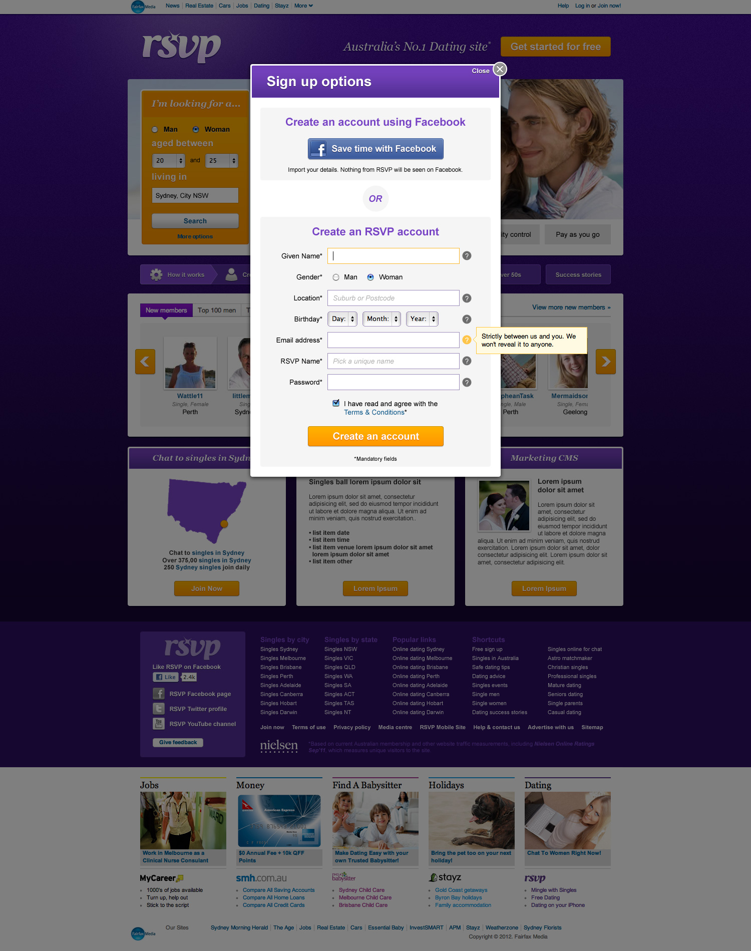
Fairfax had just redeveloped their RSVP website but it wasn’t performing as well as they’d like. It was clear when looking at the home page that very little thought was put into the users experience. There was a lot of information with no real hierarchy and it was a chore to navigate.
The client was reluctant to remove any of the home page content so we performed a UX analysis on the site and identified areas of improvement in content hierarchy, navigation, search and overall look and feel of the home and ‘stamp’ purchasing pages. The result is a much easier to use website with a fresh new look.
![]()